B2B expense management, rebuilt around the approver
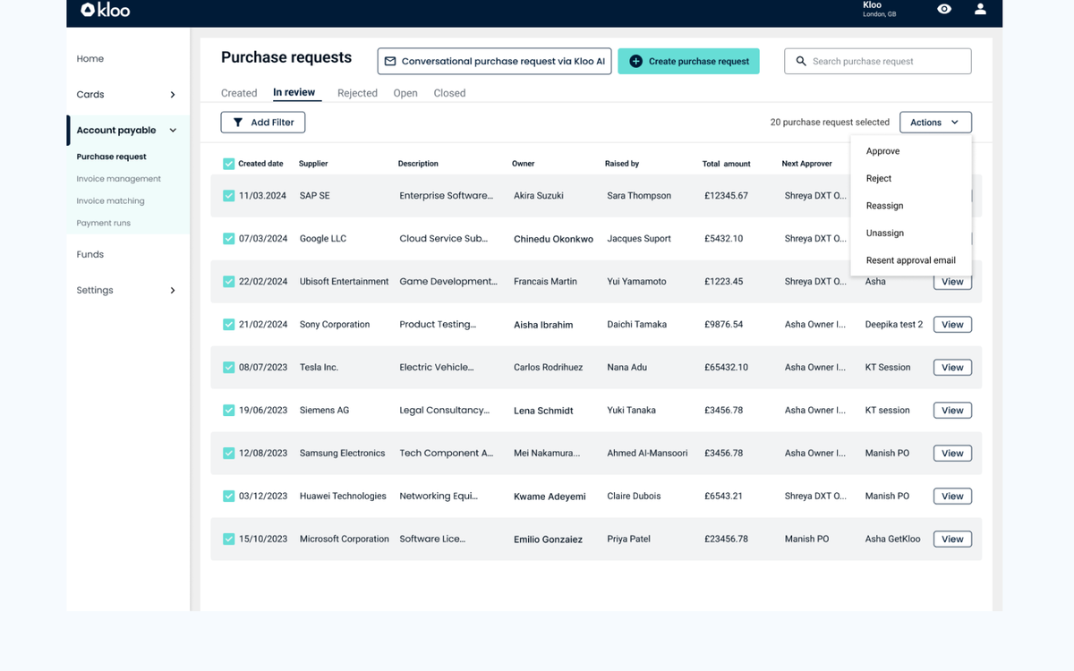
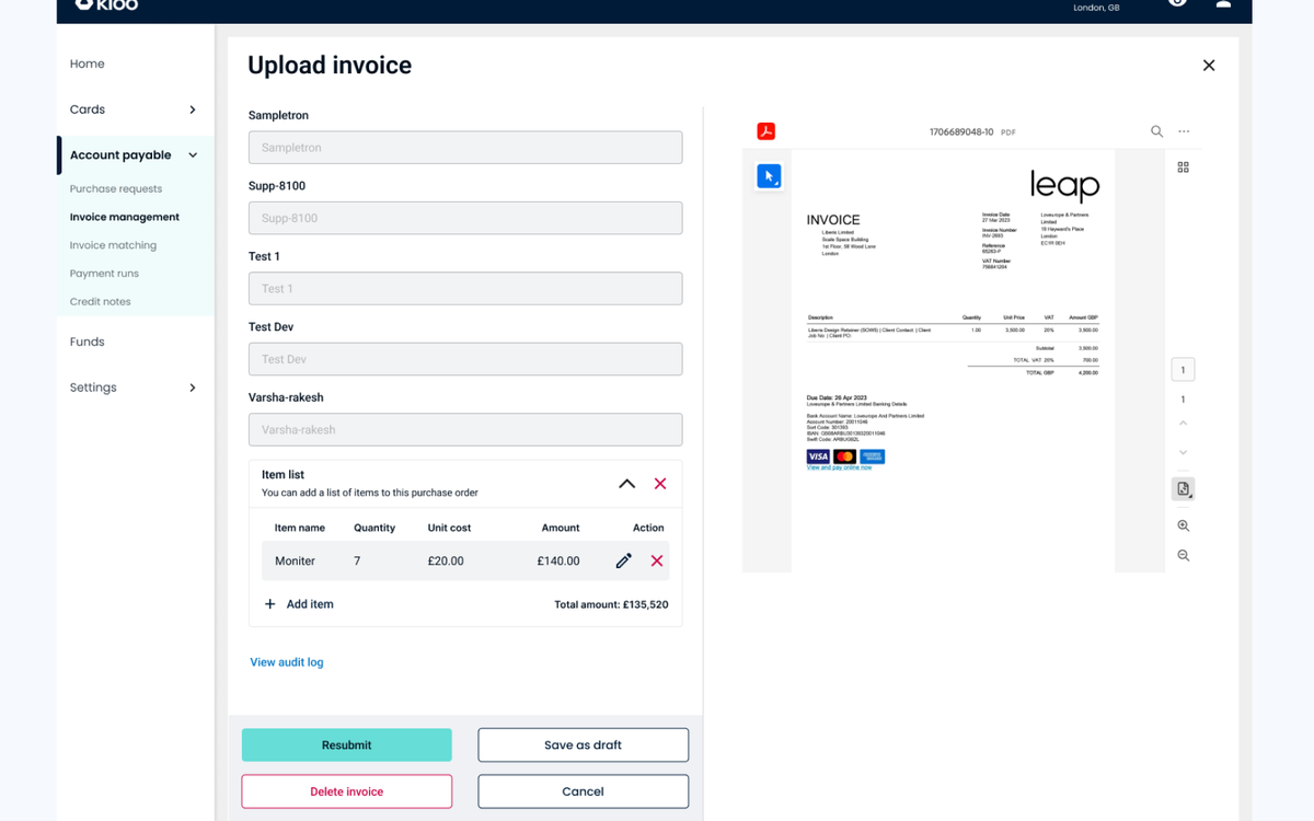
Approving a single invoice took finance teams eleven steps across three screens. I rebuilt the accounts-payable flow around progressive disclosure — full context for daily approvers, guided defaults for first-timers. Task completion rose +30% and onboarding time fell −25%.
The problem
Kloo’s accounts-payable flow had grown the way most B2B tools do: one feature at a time, in response to whichever customer complained loudest. By the time I joined, approving a single invoice took finance teams eleven steps across three screens — survivable for someone who used it twice a year, a genuine tax on the 80% of users who approved invoices daily.
The harder part was the constraint underneath it: Kloo had a live customer base mid-migration from legacy accounting tools. Whatever I shipped had to keep working for people mid-workflow, not just look better in a demo.
The decision
The obvious fix — a guided, multi-step wizard — tested well with first-time users in isolation. It also would have made the daily-approver’s job worse, adding clicks to a task they already knew how to do. I rejected it.
Instead I designed around progressive disclosure on a single screen: full context and density for the people who live in the approval queue, with guided defaults that only surface for genuinely new users. That meant a more complex front-end state model than a wizard would have needed — worth it, because it meant shipping one screen that served both populations instead of two screens that served each badly.
What shipped
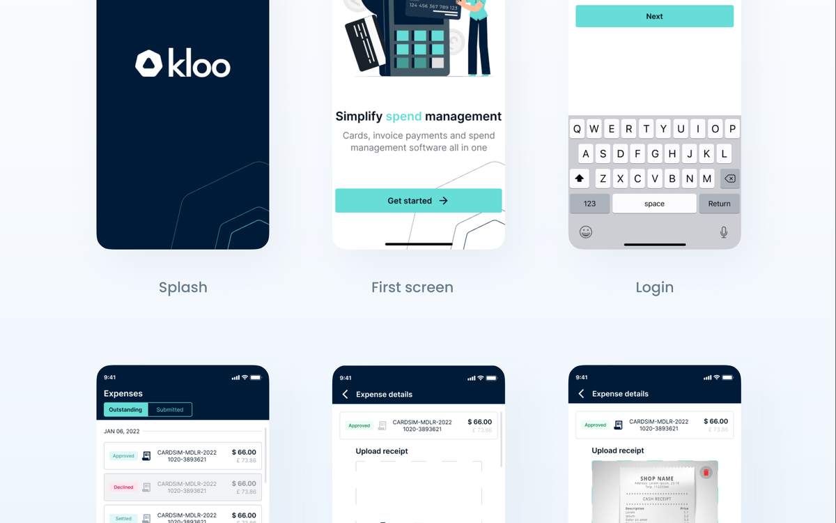
Beyond the AP flow itself, the project’s lasting output was a tokenised design system with real documentation — built from zero, not retrofitted — adopted across product teams on web, iOS and Android. That system is what made the AP redesign survivable through the platform’s later growth: new screens inherited the token set instead of reinventing it.
Result
Task completion on the AP flow rose +30%. Onboarding time for new approvers fell −25%. Both numbers came from usability testing against the legacy flow, not from launch-week enthusiasm.
Some of the detail here — specific screens, the full token documentation — sits under NDA. Happy to walk through more of it in a call.